web端看图神器viewer.js,修复移动端触摸屏下双击BUG
如果你有接到过前端看图功能的需求,那么你应该有了解或者使用过鼎鼎大名的viewer.js,这在gitcode上有6000多星的开源项目。作者是陈凤元。在github上也是有6.4k的star,是个非常不错的开源项目!
但是在网上很多文章里公布的github站点到国内的镜像,如下:
mirrors / fengyuanchen / viewerjs ・ GitCode
https://gitcode.net/mirrors/fengyuanchen/viewerjs?utm_source=csdn_github_accelerator
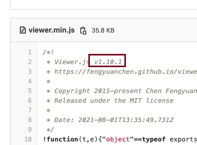
其实这个镜像的版本是1.10.1版本,这个版本在触摸屏下的是有双击的BUG的。
具体表现为双击图片后,不是以图片中心放大,到100%,而是从右下方向放大至100%的,PC端下没有问题。
最后发现,github上的版本是最新的v1.10.4版,这个版已经修复此问题。现在分享给大家:
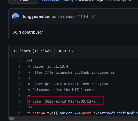
作者今年还一直在更新,非常难得的一款插件。
相信国内很多用户在用这款组件。
/UploadFiles/file/202204/2022040118443077.zip
github链接:
GitHub - fengyuanchen/viewerjs: JavaScript image viewer.
官方使用教程:
dist/
├── viewer.css
├── viewer.min.css   (compressed)
├── viewer.js        (UMD)
├── viewer.min.js    (UMD, compressed)
├── viewer.common.js (CommonJS, default)
└── viewer.esm.js    (ES Module)
Getting started
Installation
npm install viewerjs
In browser:

<link  href="/path/to/viewer.css" rel="stylesheet">
<script src="/path/to/viewer.js"></script>
The cdnjs provides CDN support for Viewer.js's CSS and JavaScript. You can find the links here.

Usage
Syntax
new Viewer(element[, options])
element

Type: HTMLElement
The target image or container of images for viewing.
options (optional)

Type: Object
The options for viewing. Check out the available options.
Example
<!-- a block container is required -->
<div>
  <img id="image" src="picture.jpg" alt="Picture">
</div>

<div>
  <ul id="images">
    <li><img src="picture-1.jpg" alt="Picture 1"></li>
    <li><img src="picture-2.jpg" alt="Picture 2"></li>
    <li><img src="picture-3.jpg" alt="Picture 3"></li>
  </ul>
</div>
// You should import the CSS file.
// import 'viewerjs/dist/viewer.css';
import Viewer from 'viewerjs';

// View an image.
const viewer = new Viewer(document.getElementById('image'), {
  inline: true,
  viewed() {
    viewer.zoomTo(1);
  },
});
// Then, show the image by clicking it, or call `viewer.show()`.

// View a list of images.
// Note: All images within the container will be found by calling `element.querySelectorAll('img')`.
const gallery = new Viewer(document.getElementById('images'));
// Then, show one image by click it, or call `gallery.show()`.
Keyboard support
Only available in modal mode.

Esc: Exit full screen or close the viewer or exit modal mode or stop play.
Space: Stop play.
Tab: Switch the focus state on the buttons in the viewer.
Enter: Trigger the click event handler on the button.
←: View the previous image.
→: View the next image.
↑: Zoom in the image.
↓: Zoom out the image.
Ctrl + 0: Zoom out to initial size.
Ctrl + 1: Zoom in to natural size.
⬆ back to top

Options
You may set viewer options with new Viewer(image, options). If you want to change the global default options, You may use Viewer.setDefaults(options).

backdrop
Type: Boolean or String
Default: true
Enable the modal backdrop, specify static for the backdrop that will not close the modal on click.

button
Type: Boolean
Default: true
Show the button on the top-right of the viewer.

navbar
Type: Boolean or Number
Default: true
Options:
0 or false: hide the navbar
1 or true: show the navbar
2: show the navbar only when the screen width is greater than 768 pixels
3: show the navbar only when the screen width is greater than 992 pixels
4: show the navbar only when the screen width is greater than 1200 pixels
Specify the visibility of the navbar.

title
Type: Boolean or Number or Function or Array
Default: true
Options:
0 or false: hide the title
1 or true or Function or Array: show the title
2: show the title only when the screen width is greater than 768 pixels
3: show the title only when the screen width is greater than 992 pixels
4: show the title only when the screen width is greater than 1200 pixels
Function: customize the title content
[Number, Function]: the first element indicate the visibility, the second element customize the title content
Specify the visibility and the content of the title.

The name comes from the alt attribute of an image element or the image name parsed from its URL.

For example, title: 4 equals to:

new Viewer(image, {
  title: [4, (image, imageData) => `${image.alt} (${imageData.naturalWidth} × ${imageData.naturalHeight})`]
});
toolbar
Type: Boolean or Number or Object
Default: true
Options:
0 or false: hide the toolbar.
1 or true: show the toolbar.
2: show the toolbar only when the screen width is greater than 768 pixels.
3: show the toolbar only when the screen width is greater than 992 pixels.
4: show the toolbar only when the screen width is greater than 1200 pixels.
{ key: Boolean | Number }: show or hide the toolbar.
{ key: String }: customize the size of the button.
{ key: Function }: customize the click handler of the button.
{ key: { show: Boolean | Number, size: String, click: Function }: customize each property of the button.
Available built-in keys: "zoomIn", "zoomOut", "oneToOne", "reset", "prev", "play", "next", "rotateLeft", "rotateRight", "flipHorizontal", "flipVertical".
Available built-in sizes: "small", "medium" (default) and "large".
Specify the visibility and layout of the toolbar its buttons.

For example, toolbar: 4 equals to:

new Viewer(image, {
  toolbar: {
    zoomIn: 4,
    zoomOut: 4,
    oneToOne: 4,
    reset: 4,
    prev: 4,
    play: {
      show: 4,
      size: 'large',
    },
    next: 4,
    rotateLeft: 4,
    rotateRight: 4,
    flipHorizontal: 4,
    flipVertical: 4,
  },
});
see more for custom toolbar.

className
Type: String
Default: ''
Custom class name(s) to add to the viewer's root element.

container
Type: Element or String
Default: 'body'
An element or a valid selector for Document.querySelector
Container to place the viewer in the modal mode.

Only available when the inline option is set to false.

filter
Type: Function
Default: null
Filter the images for viewing (should return true if the image is viewable, return false to ignore the image).

For example:

new Viewer(image, {
  filter(image) {
    return image.complete;
  },
});
Note that images without the src attribute set will be ignored by default.

fullscreen
Type: Boolean or FullscreenOptions
Default: true
Enable to request full screen when play.

Requires the browser supports Fullscreen API.

inheritedAttributes
Type: Array
Default: ['crossOrigin', 'decoding', 'isMap', 'loading', 'referrerPolicy', 'sizes', 'srcset', 'useMap']
Define the extra attributes to inherit from the original image.

Note that the basic attributes src and alt will always inherit from the original image.

initialViewIndex
Type: Number
Default: 0
Define the initial index of the image for viewing.

Also used as the default parameter value of the view method.

inline
Type: Boolean
Default: false
Enable inline mode.

interval
Type: Number
Default: 5000
The amount of time to delay between automatically cycling an image when playing.

keyboard
Type: Boolean
Default: true
Enable keyboard support.

focus
Type: Boolean
Default: true
Focus the active item in the navbar when initialized.

Requires the keyboard option set to true.

loading
Type: Boolean
Default: true
Indicate if showing a loading spinner when loading the image or not.

loop
Type: Boolean
Default: true
Indicate if enabling loop viewing or not.

If the current image is the last one, then the next one to view is the first one, and vice versa.

minWidth
Type: Number
Default: 200
Define the minimum width of the viewer.

Only available in inline mode (set the inline option to true).

minHeight
Type: Number
Default: 100
Define the minimum height of the viewer.

Only available in inline mode (set the inline option to true).

movable
Type: Boolean
Default: true
Enable to move the image.

rotatable
Type: Boolean
Default: true
Enable to rotate the image.

scalable
Type: Boolean
Default: true
Enable to scale the image.

zoomable
Type: Boolean
Default: true
Enable to zoom the image.

zoomOnTouch
Type: Boolean
Default: true
Enable to zoom the current image by dragging on the touch screen.

zoomOnWheel
Type: Boolean
Default: true
Enable to zoom the image by wheeling the mouse.

slideOnTouch
Type: Boolean
Default: true
Enable to slide to the next or previous image by swiping on the touch screen.

toggleOnDblclick
Type: Boolean
Default: true
Indicate if toggle the image size between its natural size and initial size when double click on the image or not.

In other words, call the toggle method automatically when double click on the image.

Requires dblclick event support.

tooltip
Type: Boolean
Default: true
Show the tooltip with image ratio (percentage) when zooming in or zooming out.

transition
Type: Boolean
Default: true
Enable CSS3 Transition for some special elements.

zIndex
Type: Number
Default: 2015
Define the CSS z-index value of the viewer in modal mode.

zIndexInline
Type: Number
Default: 0
Define the CSS z-index value of the viewer in inline mode.

zoomRatio
Type: Number
Default: 0.1
Define the ratio when zooming the image by wheeling the mouse.

minZoomRatio
Type: Number
Default: 0.01
Define the min ratio of the image when zooming out.

maxZoomRatio
Type: Number
Default: 100
Define the max ratio of the image when zooming in.

url
Type: String or Function
Default: 'src'
Define where to get the original image URL for viewing.

If it is a string, it should be one of the attributes of each image element. If it is a function, it should return a valid image URL.

For example:

<img src="picture.jpg?size=160">
new Viewer(image, {
  url(image) {
    return image.src.replace('?size=160', '');
  },
});
ready
Type: Function
Default: null
Shortcut of the ready event.

show
Type: Function
Default: null
Shortcut of the show event.

shown
Type: Function
Default: null
Shortcut of the shown event.

hide
Type: Function
Default: null
Shortcut of the hide event.

hidden
Type: Function
Default: null
Shortcut of the hidden event.

view
Type: Function
Default: null
Shortcut of the view event.

viewed
Type: Function
Default: null
Shortcut of the viewed event.

move
Type: Function
Default: null
Shortcut of the move event.

moved
Type: Function
Default: null
Shortcut of the moved event.

rotate
Type: Function
Default: null
Shortcut of the rotate event.

rotated
Type: Function
Default: null
Shortcut of the rotated event.

scale
Type: Function
Default: null
Shortcut of the scale event.

scaled
Type: Function
Default: null
Shortcut of the scaled event.

zoom
Type: Function
Default: null
Shortcut of the zoom event.

zoomed
Type: Function
Default: null
Shortcut of the zoomed event.

play
Type: Function
Default: null
Shortcut of the play event.

stop
Type: Function
Default: null
Shortcut of the stop event.

⬆ back to top

Methods
All methods allow chain composition.

As there are some asynchronous processes when start the viewer, you should call a method only when it is available, see the following lifecycle:

new Viewer(image, {
  ready() {
    // 2 methods are available here: "show" and "destroy".
  },
  shown() {
    // 9 methods are available here: "hide", "view", "prev", "next", "play", "stop", "full", "exit" and "destroy".
  },
  viewed() {
    // All methods are available here except "show".
    this.viewer.zoomTo(1).rotateTo(180);
  }
});
show([immediate])
immediate (optional):
Type: Boolean
Default: false
Indicates if show the viewer immediately or not.
Show the viewer.

Only available in modal mode.

hide([immediate])
immediate (optional):
Type: Boolean
Default: false
Indicates if hide the viewer immediately or not.
Hide the viewer.

Only available in modal mode.

view([index])
index (optional):
Type: Number
Default: 0 (inherits from the initialViewIndex option)
The index of the image for viewing
View one of the images with the image index. If the viewer is hidden, it will be shown first.

viewer.view(1); // View the second image
prev([loop=false])
loop (optional):
Type: Boolean
Default: false
Indicate if turn to view the last one when it is the first one at present.
View the previous image.

next([loop=false])
loop (optional):
Type: Boolean
Default: false
Indicate if turn to view the first one when it is the last one at present.
View the next image.

move(x[, y = x])
x:

Type: Number
The moving distance in the horizontal direction.
y (optional):

Type: Number
The moving distance in the vertical direction.
If not present, its default value is x
Move the image with relative offsets.

viewer.move(1);
viewer.move(-1, 0); // Move left
viewer.move(1, 0);  // Move right
viewer.move(0, -1); // Move up
viewer.move(0, 1);  // Move down
moveTo(x[, y = x])
x:

Type: Number
The new position in the horizontal direction.
y (optional):

Type: Number
The new position in the vertical direction.
If not present, its default value is x.
Move the image to an absolute point.

rotate(degree)
degree:
Type: Number
Rotate right: requires a positive number (degree > 0)
Rotate left: requires a negative number (degree < 0)
Rotate the image with a relative degree.

viewer.rotate(90);
viewer.rotate(-90);
rotateTo(degree)
degree:
Type: Number
Rotate the image to an absolute degree.

viewer.rotateTo(0); // Reset to zero degree
viewer.rotateTo(360); // Rotate a full round
scale(scaleX[, scaleY])
scaleX:

Type: Number
Default: 1
The scaling factor to apply on the abscissa of the image
When equal to 1 it does nothing.
scaleY (optional):

Type: Number
The scaling factor to apply on the ordinate of the image
If not present, its default value is scaleX.
Scale the image.

viewer.scale(-1); // Flip both horizontal and vertical
viewer.scale(-1, 1); // Flip horizontal
viewer.scale(1, -1); // Flip vertical
scaleX(scaleX)
scaleX:
Type: Number
Default: 1
The scaling factor to apply on the abscissa of the image
When equal to 1 it does nothing
Scale the abscissa of the image.

viewer.scaleX(-1); // Flip horizontal
scaleY(scaleY)
scaleY:
Type: Number
Default: 1
The scaling factor to apply on the ordinate of the image
When equal to 1 it does nothing
Scale the ordinate of the image.

viewer.scaleY(-1); // Flip vertical
zoom(ratio[, hasTooltip])
ratio:

Type: Number
Zoom in: requires a positive number (ratio > 0)
Zoom out: requires a negative number (ratio < 0)
hasTooltip (optional):

Type: Boolean
Default: false
Show tooltip
Zoom the image with a relative ratio

viewer.zoom(0.1);
viewer.zoom(-0.1);
zoomTo(ratio[, hasTooltip])
ratio:

Type: Number
Requires a positive number (ratio > 0)
hasTooltip (optional):

Type: Boolean
Default: false
Show tooltip
Zoom the image to an absolute ratio.

viewer.zoomTo(0); // Zoom to zero size (0%)
viewer.zoomTo(1); // Zoom to natural size (100%)
play([fullscreen])
fullscreen (optional):
Type: Boolean or FullscreenOptions
Default: false
Indicate if request fullscreen or not.
Play the images.

stop()
Stop play.

full()
Enter the modal mode.

Only available in inline mode.

exit()
Exit the modal mode.

Only available in inline mode.

tooltip()
Show the current ratio of the image by percentage.

Requires the tooltip option set to true.

toggle()
Toggle the image size between its current size and natural size.

Used by the toggleOnDblclick option.

reset()
Reset the image to its initial state.

update()
Update the viewer instance when the source images changed (added, removed, or sorted).

If you load images dynamically (with XMLHTTPRequest), you can use this method to add the new images to the viewer instance.

destroy()
Destroy the viewer and remove the instance.

⬆ back to top

Events
All events can access the viewer instance with this.viewer in its handler.

Be careful to use these events with other components which have the same event names, e.g.: Bootstrap's modal.

let viewer;

image.addEventListener('viewed', function () {
  console.log(this.viewer === viewer);
  // > true
});

viewer = new Viewer(image);
ready
event.bubbles: true
event.cancelable: true
event.detail: null
This event fires when a viewer instance is ready for viewing.

In modal mode, this event will not be triggered until you click on one of the images.

show
event.bubbles: true
event.cancelable: true
event.detail: null
This event fires when the viewer modal starts to show.

Only available in modal mode.

shown
event.bubbles: true
event.cancelable: true
event.detail: null
This event fires when the viewer modal has shown.

Only available in modal mode.

hide
event.bubbles: true
event.cancelable: true
event.detail: null
This event fires when the viewer modal starts to hide.

Only available in modal mode.

hidden
event.bubbles: true
event.cancelable: false
event.detail: null
This event fires when the viewer modal has hidden.

Only available in modal mode.

view
event.bubbles: true
event.cancelable: true
event.detail.index:
Type: Number
The index of the original image.
event.detail.image:
Type: HTMLImageElement
The current image (a clone of the original image).
event.detail.originalImage:
Type: HTMLImageElement
The original image.
This event fires when a viewer starts to show (view) an image.

viewed
event.bubbles: true
event.cancelable: false
event.detail: the same as the view event.
This event fires when a viewer has shown (viewed) an image.

move
event.bubbles: true
event.cancelable: true
event.detail.x:
Type: Number
The new position in the horizontal direction.
event.detail.y:
Type: Number
The new position in the vertical direction.
event.detail.oldX:
Type: Number
The old position in the horizontal direction.
event.detail.oldY:
Type: Number
The old position in the vertical direction.
event.detail.originalEvent:
Type: Event or null
Options: pointermove, touchmove, and mousemove.
This event fires when a viewer starts to move an image.

moved
event.bubbles: true
event.cancelable: false
event.detail: the same as the move event.
This event fires when a viewer has moved an image.

rotate
event.bubbles: true
event.cancelable: true
event.detail.degree:
Type: Number
The new rotation degrees.
event.detail.oldDegree:
Type: Number
The old rotation degrees.
This event fires when a viewer starts to rotate an image.

rotated
event.bubbles: true
event.cancelable: false
event.detail: the same as the rotate event.
This event fires when a viewer has rotated an image.

scale
event.bubbles: true
event.cancelable: true
event.detail.scaleX:
Type: Number
The new scaling factor in the horizontal direction.
event.detail.scaleY:
Type: Number
The new scaling factor in the vertical direction.
event.detail.oldScaleX:
Type: Number
The old scaling factor in the horizontal direction.
event.detail.oldScaleY:
Type: Number
The old scaling factor in the vertical direction.
This event fires when a viewer starts to scale an image.

scaled
event.bubbles: true
event.cancelable: false
event.detail: the same as the scale event.
This event fires when a viewer has scaled an image.

zoom
event.bubbles: true
event.cancelable: true
event.detail.ratio:
Type: Number
The new (next) ratio of the image (imageData.width / imageData.naturalWidth).
event.detail.oldRatio:
Type: Number
The old (current) ratio of the image.
event.detail.originalEvent:
Type: Event or null
Options: wheel, pointermove, touchmove, and mousemove.
This event fires when a viewer starts to zoom (in or out) an image.

zoomed
event.bubbles: true
event.cancelable: false
event.detail: the same as the zoom event.
This event fires when a viewer has zoomed (in or out) an image.

play
event.bubbles: true
event.cancelable: true
event.detail: null
This event fires when the viewer starts to play.

You can abort the playing process by calling event.preventDefault().

stop
event.bubbles: true
event.cancelable: true
event.detail: null
This event fires when the viewer starts to stop.

You can abort the stopping process by calling event.preventDefault().

⬆ back to top

No conflict
If you have to use another viewer with the same namespace, call the Viewer.noConflict static method to revert to it.

<script src="other-viewer.js"></script>
<script src="viewer.js"></script>
<script>
  Viewer.noConflict();
  // Code that uses other `Viewer` can follow here.
</script>
Browser support
Chrome (latest)
Firefox (latest)
Safari (latest)
Opera (latest)
Edge (latest)
Internet Explorer 9+
Contributing
Please read through our contributing guidelines.

Versioning
Maintained under the Semantic Versioning guidelines.

License
MIT © Chen Fengyuan


 天下网吧・网吧天下
